Designing and building a new shopfront sign? make sure to follow these hot tips and ideas to streamline the process and to ensure the best results!
RESEARCH YOUR COMPETITORS
When starting out, don’t be afraid to check out your competitors. Some of them have likely been around for decades and have the experience to go with it when it comes to their signage, so take a look at how they make their shopfronts more appealing to their target market and use it in ways to engage with their customers.
Don’t forget to check out how they incorporate some of their products and elements in their front windows, which is often a skill that is overlooked by new businesses.
SEASONAL DISPLAYS
Sometimes there are specific seasons that will draw a massive crowd, which can allow you to specifically target your market by showing them exactly what they need.
Choose the right colours for each season, like earthy colours to represent autumn or orange, red, or yellow, to represent summer.
Temporary standalone banners are also a great way to show what’s on sale or on offer.
EYE-LEVEL IS BUY LEVEL
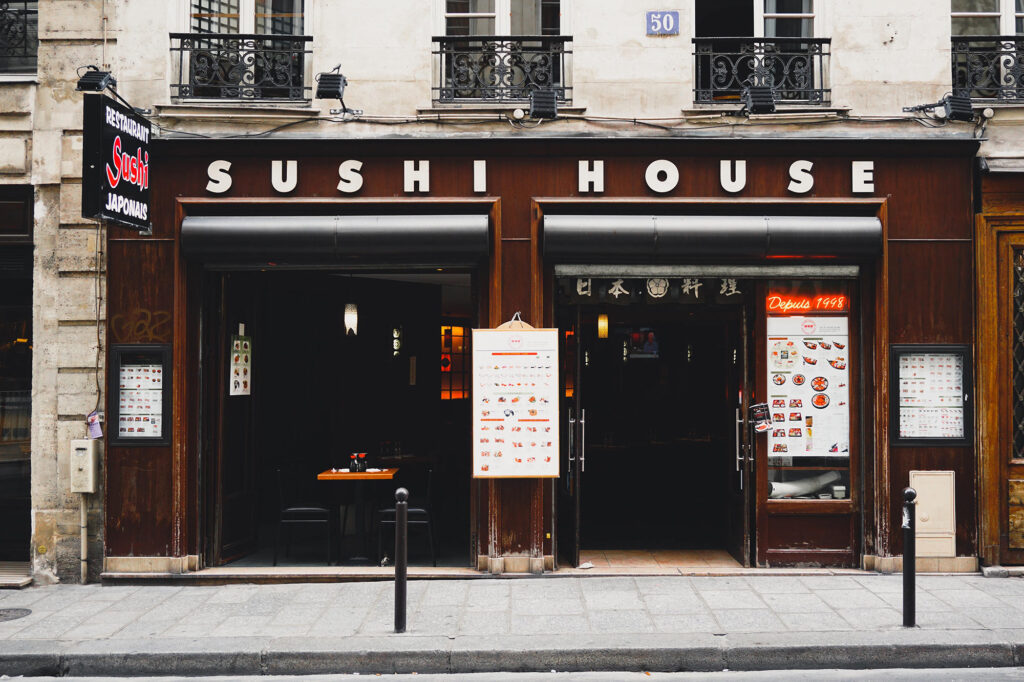
Show your displayed merchandise at eye level when someone is looking into your window from the outside, whilst showing your best or newest products there.
The reasons for doing this are clear – because you want to capture their attention – and if it’s not presented in front of our eyes, we tend to look at another product that does.
MAKE IT EASY TO READ
One thing you don’t want your sign to struggle with is the word being difficult to read or even harder to pronounce the way you intend it to be read.
Many businesses make this mistake when they place style above clarity. So whilst your sign might look flashy, it’s not helping you if people are finding it hard to read.
A way to avoid this kind of confusion is to carefullyconsider is the type of font you’re using.
It’s best to use a simpler font than the extravagant one, or your customers might not be able to comprehend with the distractions displayed in front of them.
USING THE RIGHT COLOURS
Colours really matter, especially if you’re trying to communicate with specific emotions that enhance and represent your branding.
Every color has a meaning, and doing your research on what each colour represents is highly recommended, as it will help your customers interpret your signs much better and create the ‘mood’ that you are wanting to create for your business.
For example; blue communicates peace and tranquillity; Red could mean anger, violence and aggression, but on the flip side, red can also mean romantic love, power, boldness and courage.
Having a graphic designer who understands these colour palettes will head you in the right direction.
BE THE ODD ONE OUT
Your business is original and different, meaning your signage should be the same. To avoid being a needle in a haystack in an ocean of signage, make a bold statement that makes alot of noise in a unique way that only your business can do.
Even customers that didn’t plan to visit your store should have a curiosity after seeing your sign, and this can only come about if your sign is eye-catching, original and different.
GET THE RIGHT SIZE AND QUANTITY
When it comes to signage, size matters. How big do you want your signage to be? Will there be one or many? Do they contrast well enough with the background to ensure they stand out?
Whatever the questions are, you don’t want to overcrowd your shopfront, otherwise your customers will pass it by or get confused from all of the distractions going on.
The best solution is to have one sign that is big and clear enough that says what it needs to say and nothing more.
Take a step back from your shopfront and observe how far you’d want your sign to be seen. Like the golden arches of MacDonald, you want your sign to have the same kind of significant impact.
DON’T OVERCROWD YOUR DESIGN
When it comes to signage, the ‘less is more’ principle is the way to do, because overcrowding your design can make it extremely busy and overwhelming for your customers to absorb.
Be simple and unique so that customers can process your signage alot easier. As mentioned before, having too much on your design can potentially deter your customers away.
If you need some help with starting the process, from the design to the build for your shopfront sign, feel free to submit your details at Orange Signs and we’ll take care of everything from there.